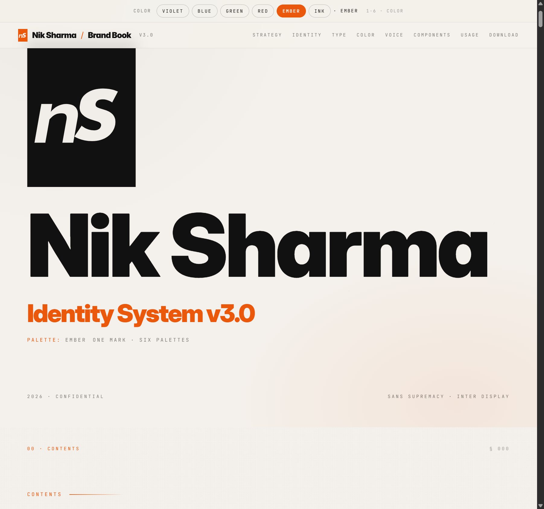
COLOR VIOLET BLUE GREEN RED EMBER INK · EMBER 1-6 · COLOR Nik Sharma / Brand Book V3.0 STRATEGY IDENTITY TYPE COLOR VOICE COMPONENTS USAGE DOWNLOAD NIK SHARMA / BRAND BOOK SANS SUPREMACY · V3.0 Nik Sharma Identity System v3.0 PALETTE: EMBER ONE MARK · SIX PALETTES 2026 · CONFIDENTIAL SANS SUPREMACY · INTER DISPLAY 00 · CONTENTS § 000 CONTENTS What's in here. A working system. Read it once, reference it forever. Sixteen sections, one voice, zero hedging. § 01 The Thesis 003 § 02 Who It's For 006 § 03 Personality 009 § 04 The Wordmark 013 § 05 The Mark 017 § 06 Clear Space & Scale 020 § 07 Misuse 023 § 08 Color System 027 § 09 Typography 031 § 10 Type In The Wild 037 § 11 Voice & Copy 041 § 12 Components 046 § 13 Sample Pages 051 § 14 Across Properties 056 § 15 Closing 060 § — Download & License 062 01 · THESIS § 003 01 · THESIS We build things that feel as sharp as they sound. This is the identity system for Nik Sharma's personal brand and the properties that live under it. It is not decoration. It is the visual grammar of an operator who writes like a journalist, builds like an engineer, and closes like a banker. Everything in this book obeys three commitments. Pick anything, a landing page, a deck, an email, a t-shirt, and you can test it against these three. If a piece fails all three, it isn't ours. 01 Operator-first Written for the person who actually ships. Every page should answer a specific question the operator already has. If you can't name the question, cut the section. 01 first rule 02 Evidence-cited Claims without receipts don't make it to print. Every number lives with a source. Every case study lives with a client name. No vibes-as-proof. 100 % cited 03 Ships weekly Limited Supply publishes every Sunday. The DM gets answered. The deck gets sent. This brand has a drumbeat, and the drumbeat is the product. 52 issues / year 01 · A Positioning The single sentence that everything in this system serves: Nik Sharma is the operator's operator for modern consumer brands, the one who ships, cites, and tells you the truth in writing. 02 · CUSTOMER § 006 02 · WHO IT'S FOR The operator. The investor. The builder. Not the casual reader. Not the tourist. This brand talks to people who are already in motion, who already know CAC from LTV, who are looking for the one tactic that saves them six weeks. O The Operator PRIMARY · 62% OF AUDIENCE Runs growth or ops inside a $5M–$200M DTC brand Owns at least one P&L line Subscribes to Limited Supply, listens on walks Needs a specific tactic, cited, this week Pays for speed and judgment, not frameworks I The Investor / Partner SECONDARY · 28% OF AUDIENCE GP at a consumer or growth-stage fund Operator-LP at a family office Wants a read on category, brand, and team Evaluates pages the way they evaluate pitches Reads the footer before the headline Write for the person who is already taking notes. Everyone else can catch up. NIK · INTERNAL PLAYBOOK · 2026 Psychographic, not demographic. We don't care if they're 27 or 47. We care that they've already tried three things this quarter and need the fourth to work. Our reader is skeptical, fast, and allergic to fluff. They don't want to be educated; they want to be armed. This is why every surface we ship leads with the answer and puts the background material below the fold. If someone has to scroll to learn what we think, we've already lost them. READS THE NAV BEFORE THE HERO CHECKS CITATIONS BEFORE QUOTING SCREENSHOTS PRICING PAGES FORWARDS THE GOOD PARTS TO THEIR TEAM WILL UNFOLLOW FOR ONE BAD TAKE 03 · PERSONALITY § 009 03 · PERSONALITY Six traits. Non-negotiable. Every piece of copy, every layout decision, every pixel choice has to pass through these six. If a trait is missing, the piece is wrong, even if the typography is perfect. 01 Direct Lead with the answer. Context comes second. The reader doesn't need a runway, they're already in the air. 02 Opinionated If we don't have a take, we don't publish. Neutral is a tell for unfinished thinking. 03 Tested Everything we recommend, we shipped first. If we haven't shipped it, we say so out loud. 04 Fast Short sentences when speed matters. Long paragraphs only when nuance is required. Never both. 05 Evidence-cited Every claim lives with a source, a screenshot, or a receipt. If we can't cite it, we cut it. 06 No filler No "great question." No "certainly." No em-dashes. Zero ceremony between the reader and the point. The one-line test. Before anything ships, read the first sentence aloud. If it could appear on a competitor's site with a different logo, rewrite it. Our voice is specific or it isn't ours. HOUSE RULE When in doubt, cut the adjective. The noun is almost always doing the work already. 04 · WORDMARK § 013 04 · THE WORDMARK One name. One weight. One way. The wordmark is "Nik Sharma" set in Inter Display at 200 pixels, weight 900, tracking −0.04em. That is the mark. There is no alternative. No italic, no outline, no variant weights. Nik Sharma INTER DISPLAY · 900 · 200 PX · TRACKING -0.04EM Nik Sharma REVERSED · INK GROUND Nik Sharma ACCENT LOCKUP · USE SPARINGLY Construction. The wordmark is not a drawing. It is typography set correctly. Use Inter Display at weight 900, apply the tracking token --display-track (−0.04em), and leave it alone. Never outline, shadow, or stroke it. Never substitute a similar typeface. The grid below shows the construction frame. Each unit is equal to the x-height of the lowercase "i" in Inter Display. Minimum clear space on all four sides is 2 units. 2 UNITS 2 UNITS 2 UNITS 2 UNITS Nik Sharma Acceptable lockups. Three arrangements. In order of preference. Nik Sharma A · INLINE (DEFAULT) Nik Sharma B · STACKED (NARROW SPACES) C · MARK ONLY (AVATAR, FAVICON) 05 · MARK § 017 05 · THE MARK The Mark. One mark. nS. Black stencil, italic, portrait. Built to read at every scale. The mark is the wordmark's shortest path. Lowercase n leads, uppercase S rises above the x-height. Ascending-line motion. Carved stencil-style out of a portrait rectangle so it reads as architecture, not decoration. Wherever the wordmark can't fit, this carries the brand. THE CANONICAL MARK · 400 PX · INK ON PAPER Size ladder. The same geometry from favicon to billboard. No variants, no redraws. 16 PX · FAVICON 40 PX · NAV / AVATAR 80 PX · SIGNATURE / SIDEBAR 200 PX · COVER / HERO 400 PX · POSTER / STAGE On paper · on ink · on accent. The mark inherits currentColor. Three approved grounds. Nothing else. ON PAPER · INK MARK ON INK · PAPER MARK ON ACCENT · WHITE MARK Clear space. Padding on all four sides equals 25% of the mark's width. Nothing else may enter that frame. 0.25W 0.25W 0.25W 0.25W Clear space = mark width × 0.25 on every side When to use it. The mark appears where the wordmark cannot. Browser tabs. App icons. Loading states. Lower-third bugs on speaker video. The signature line of an email. The footer of a deck. Never as decoration next to the wordmark, they are never used together. Treat the mark like a full stop. It means "this is Nik's." Putting it on something that isn't Nik's is the only way to get it wrong. RULE OF ONE Wordmark or mark. Never both on the same surface. Pick the one the space demands and commit. 06 · CLEAR SPACE § 020 06 · CLEAR SPACE & SCALE Protect the air around it. The wordmark breathes. Minimum clear space on every side is 2× the x-height of Inter Display. Minimum display size on screen is 16 px cap-height; below that, switch to the emblem. ↕ 2x ↕ 2x ↔ 2x ↔ 2x Nik Sharma Size map. Three sizes, three contexts. Nik Sharma 22 / 28 PX · NAV, FOOTER, EMAIL SIG Nik Sharma 48 / 56 PX · DECK TITLE SLIDE, HERO SECONDARY Nik Sharma 72 PX+ · COVER ART, POSTER, ON-STAGE Placement. On any surface, the wordmark sits in one of five anchored positions: top-left, top-right, bottom-left, bottom-right, or dead center. Never floated mid-layout. Never rotated. Never stacked against imagery without a 2-unit safe zone. On dark photography, use the reversed lockup. On complex or busy imagery, use the ink lockup on a white card, inset from the edge by 24 px minimum. 07 · MISUSE § 023 07 · MISUSE Eight ways to break it. Don't. Every mistake in this section has happened at least once. It is faster to show them than to describe them. If you see any of these in the wild, replace the asset and tell the maintainer. ✕ Nik DON'T STRETCH ✕ Nik DON'T RECOLOR OUTSIDE PALETTE ✕ Nik DON'T ROTATE ✕ Nik DON'T OUTLINE ✕ Nik DON'T ADD SHADOW ✕ Nik DON'T GRADIENT-FILL ✕ Nik DON'T PLACE ON ARBITRARY COLOR ✓ Nik DO · CLEAN · INK ON BG ENFORCEMENT If a vendor returns a file that violates any of the above, do not edit it. Reject and request a rebuild. Every bad version that escapes becomes the version someone else references. 08 · COLOR § 027 08 · COLOR SYSTEM Three colors. One of them, rarely. Warm off-white is the page. Ink is the word. The accent is the emphasis, and it appears exactly once per screen. Break that rule and the system is dead. The accent slot ships with six approved palettes. Pick one per property and hold the line. 70% · GROUND Paper HEX#F4F1EC RGB244 · 241 · 236 CMYK3 · 3 · 7 · 0 TOKEN--paper 25% · WORD Ink HEX#111111 RGB17 · 17 · 17 CMYK0 · 0 · 0 · 93 TOKEN--ink 5% · EMPHASIS Accent · Ember TOKEN--accent USEOne cut per screen NOTEPalette-switchable SEESix options below Six approved accents. Same role, six flavors. Each property locks one at build time. Swap at the top to preview the full system under any palette. VIOLET · #5E5BE7 BLUE · #2563EB GREEN · #15803D RED · #DC2626 EMBER · #EA580C INK · #111111 Violet is the editorial default. Blue for operator/fintech energy. Green for health and wellness. Red for editorial urgency and reports. Ember for campaign work and warmer brands. Ink is the editorial pure variant: no accent, with heavier rules and underlines doing the work of color. Secondary (utility only). BACKGROUND · DEEP Cream HEX#ECE7DF USECard grounds SURFACE White HEX#FFFFFF USEElevated cards NEUTRAL Stone HEX#E9E6E0 USEDividers, chrome Ratio. Paper dominates. Ink is the next weight. Accent is the knife, one cut per screen. 70% · PAPER 25% · INK 5% Accent appears once. Per screen. Per slide. Per page. Use it on the word you want the reader to notice, on one CTA, on the emblem. Using the accent twice is the single fastest way to unbrand the system. If you need a second highlight, use weight, not color. Bold the word. Underline it. Color is reserved. ACCENT RULE One accent. One place. If you find yourself adding a second, something earlier in the layout is fighting for attention, fix that first. Approved gradients. Three. No others. All hit the same accent endpoint. G · 01 · PAPER → ACCENT WASH HERO BACKGROUNDS G · 02 · INK → MIDNIGHT DARK HEROES · COVER ART G · 03 · ACCENT → ACCENT-STRONG CTA · EMPHASIS TILES 09 · TYPOGRAPHY § 031 09 · TYPOGRAPHY Two faces. One display, one mono. Inter Display carries the voice at weight 900, tight tracking, confident. Inter Variable carries the argument in the body at 400, long-form and readable at 15 pixels. JetBrains Mono carries the metadata, small, spaced, factual. This is Sans Supremacy. Ship it sharp. Type scale. One scale, applied everywhere. Any deviation from these tokens is a bug. DISPLAY 900 / 0.92 / -0.04EM Sharp. H1 900 / 1.0 / -0.035EM Build weekly. H2 900 / 1.0 / -0.03EM Cite the receipt. H3 800 / 1.1 / -0.02EM Answer the question. LEAD 500 / 1.4 / -0.01EM Lead with the sharpest sentence you have. BODY 400 / 1.55 / 0EM Body copy sits at 15 pixels on desktop, 16 on mobile, with a line-height of 1.55 and a maximum measure of 65 characters. We optimize for long-form readability, not density. CAPTION 500 / 1.4 / 0EM Captions, photo credits, chart annotations. MICRO 500 / 1.3 / 0EM Footnote, small print, source line. MONO 500 / 1.6 / 0.1EM SECTION · METADATA · v3.0 · 2026 OpenType & details. Optical size tuning is on where supported. Ligatures are on. Tabular numerals are on for any data table. Fractions on for pricing. Old-style figures off, we use lining figures everywhere. Your brand is the operator's side. A landing page is a lever. When you pull it, two things should happen: the reader understands what the product is, and they understand why this version of it is for them. Everything else is decoration. PAIRING · INTER DISPLAY 42 · INTER BODY 15 · JETBRAINS MONO 11 Face map. ROLE FAMILY WEIGHT TRACKING USE DisplayInter Display 900 -0.04em Wordmark, H1/H2/H3, pullquotes, data numerals BodyInter Variable 400 / 500 0em Lead, body, list items, button labels MonoJetBrains Mono 500 +0.2em (metadata), +0.06em (code) Eyebrows, section labels, captions, tokens 10 · IN THE WILD § 037 10 · TYPOGRAPHY IN THE WILD How it behaves under load. Three live surfaces. A report hero, a product page, an internal dashboard. Same scale, same palette, three very different jobs. The type system has to hold on all three. vms.nik.co/report REPORT · Q4 2025 The VMS category is eating subscription. Subscribe rates crossed 42% across our audit set. Here is what changed, who benefits, and where the margin moved. CITED · 26 SOURCES Read the report → brand.co/daily Daily DAILY · FLAGSHIP Daily Stack Three ingredients with actual clinical weight behind them. Dosed at study levels. Nothing else. $42/ 30 days Add to cart dash.nik.co MRR $48.2K ▲ 12.4% SUBS 1,247 ▲ 3.1% CAC $38 ▼ -4.2% LTV $412 ▲ 8.9% What breaks the system. Same hero. Same job. One built on the tokens, one built on vibes. DO · ON-SYSTEM We audit growth engines, not vibes. One sentence. Leads with the answer. Display weight. Tight tracking. Body copy sits at the intended size. This reads as authored. DON'T · OFF-SYSTEM Welcome to our growth audit services Generic serif. Loose tracking. Starts with "welcome." No claim, no edge, no hand. This could belong to anyone with a Wix site. 11 · VOICE § 041 11 · VOICE & COPY Write it the way Nik says it. Six rules. Copy that breaks any of them has to be rewritten or cut. No exceptions for deadline pressure, client sensitivity, or "but it reads fine." The rules are the voice. 01 Short sentences when speed matters. The first three sentences of anything should be the three sharpest. Long paragraphs are for the proof, not the claim. DO We ship landing pages that convert. On Monday. Cited, tested, no ceremony. DON'T In today's rapidly evolving digital landscape, we endeavor to provide landing page solutions that drive conversion, optimized for modern consumer behavior. 02 Active verbs. Every sentence. Things happen because someone did them. Name that someone. Passive voice is where claims go to die. DO Our team audited 34 LPs and rebuilt the 11 that leaked the most money. DON'T An audit was conducted on 34 landing pages, of which several were identified as underperforming. 03 No em-dashes. Ever. The em-dash is the AI tell. We use periods, commas, or parentheses. If the sentence needs an em-dash to hold together, the sentence needs to be two sentences. DO Our CAC fell 38%. The reason was simple: we cut the two worst channels. DON'T Our CAC fell 38%, a reduction driven by, as we now know, channel rationalization. 04 Specific proof. Always. Numbers, names, dates, screenshots. "A big brand" is not a case study. "Flexpower, Q3 2025, +62% add-to-cart" is. DO Flexpower's hero rewrite shipped in 9 days and lifted add-to-cart by 62%. DON'T We helped a leading wellness brand meaningfully improve key conversion metrics. 05 Contrarian when honest. If the prevailing wisdom is wrong, say so. Don't hedge to sound balanced. The value of this brand is the take. DO Most DTC subscription programs lose money. Ours don't, and here is the math. DON'T Some might argue subscription programs have mixed results, depending on perspective. 06 Zero filler. "At the end of the day." "In today's world." "It goes without saying." If it goes without saying, let it go without saying. Strike the line. DO Subscribe rate is a margin problem, not a marketing problem. DON'T At the end of the day, in today's ecommerce world, subscribe rate is something many brands struggle with. 12 · COMPONENTS § 046 12 · COMPONENTS The working parts of the system. Every surface we ship is built from this kit. Add a new component only when none of these will do the job, and document it back into this book when you do. BUTTONS · 5 VARIANTS Primary Secondary Ghost Destructive Small Primary is ink on paper. Secondary is outlined. Ghost for tertiary. Destructive uses the single danger color. Use one primary per view. FORM INPUT + STATES ✕ ENTER A VALID EMAIL Subscribe Single stroke, one focus color, one error color. Inputs never need a drop shadow. PILL NAV STRATEGY IDENTITY VOICE SHIP For three-to-five item segmentation. Active item is ink-filled. No hover state, no underlines. CALLOUT · QUOTE HOUSE RULE Accent appears once per screen. Count the accents before you ship. "Ship weekly or the drumbeat dies." — NIK · LIMITED SUPPLY PRODUCT CARD DAILY Daily Stack Three ingredients with actual clinical weight. Dosed at study levels. $42 · 30 days EDITORIAL CARD LIMITED SUPPLY · ISSUE 184 Why subscribe rates are a margin problem. Most DTC brands treat subscribe as a marketing metric. It isn't. It's a gross-margin decision being dressed up in creative. NIK · 7 MIN READ · 2026-04-19 DATA CARD · KPI CONTRIBUTION MARGIN 38.4% ▲ +6.1 pts vs Q3 · cohort-weighted DATA TABLE METRIC Q3 Q4 Δ CAC $58 $38 -34% AOV $62 $74 +19% Sub rate 28% 42% +14 pts Comparison table. Used on PDPs, on pricing pages, on report summaries. FEATURE OURS AVERAGE DTC STATUS QUO Clinical evidence Cited, linkedVibes None Subscribe churn 2.8% / mo6.2% 9.1% First-order NPS 7248 30 Time to re-order 24 days38 days 62 days 13 · SAMPLE PAGES § 051 13 · SAMPLE PAGES The system, fully dressed. Three representative surfaces, one per job. Each is built only from tokens and components defined in the previous sections. Nothing here is bespoke. Every part is reusable. All brand names below are placeholders. SAMPLE 01 · LANDING REPORT HERO · VMS.NIK.CO REPORT · CATEGORY AUDIT · Q4 2025 The VMS category is eating subscription. 34 brands. 260 SKUs. 12 weeks of checkout data. Subscribe rates crossed 42% across the audit set, and the brands winning share aren't the ones with the best hero image. Read the report → SUBSCRIBE RATE 42% Audit set · n = 34 brands · 2025 SAMPLE 02 · PRODUCT PDP · BRAND.CO / DAILY DAILY STACK SAMPLE BRAND · DAILY · FLAGSHIP Daily Stack Three ingredients with actual clinical weight behind them. Dosed at the levels the studies used. Nothing else. $42 / 30 SERVINGS · FREE SHIP Add to cart Subscribe · $36 3RD-PARTY TESTED GMP FACILITY NO FILLERS CITED DOSING SAMPLE 03 · INTERNAL DASHBOARD · DASH.NIK.CO WEEK TO DATE · REVENUE $128,442 ▲ 18.2% vs last week · +$19.8K NEW SUBS 482 ▲ 12% CHURN (30D) 2.8% ▼ -0.3 pts CONTRIBUTION MGN 38% ▲ +6.1 pts CAC · BLENDED $38 ▲ improved LTV:CAC 10.8x ▲ +1.4x 14 · ACROSS PROPERTIES § 056 14 · USAGE ACROSS PROPERTIES One system. Nine surfaces. Every property below runs on the same tokens. Same paper. Same ink. Same accent, used once. Pages should read like issues of the same magazine, different articles, same typography, same hand. lp.nik.co Landing Pages The reference index for high-converting DTC LP patterns. The flagship reading surface. vms.nik.co VMS Report Quarterly vitamin & supplement category audit. Report hero uses the same type scale as components. flexpower.com Flexpower (client) Topical relief brand. PDP + LP program applying the system inside a client context. heart.nik.co Heart Report Cardiometabolic consumer category brief. Long-form editorial treatment, same type stack. hormonal.nik.co Hormonal Report Women's hormone-health consumer brief. Evidence-led with embedded citations. campaign.brand.co Category Companion Sample category/campaign page. Product-forward, short copy, heavy data. dash.nik.co Internal Dashboard Revenue, CAC, cohort, churn. Tabular numerals on. One KPI ever gets the accent. fireflies.nik.co Fireflies Notes Meeting-to-memo tool. System applies to summary exports and shared recap pages. identity.nik.co Identity Studio This brand book. The document you are reading. The reference for every other surface. CROSS-PROPERTY RULE If a property can't be built from this book without custom work, the book is incomplete, not the property. File a change request before shipping new components. 15 · CLOSING § 060 15 · CLOSING This is v3.0. It will evolve. A system is only useful if it's maintained. This book ships with an owner, a review cadence, and a changelog. When the world shifts, new fonts, new platforms, new clients, the book shifts with it. Never silently. Version history. VERSION DATE CHANGE OWNER v3.0 2026-04-21 Committed to Sans Supremacy. Six-palette accent system (Violet, Blue, Green, Red, Ember, Ink). One canonical mark: nS, black stencil, italic, carved from a portrait rectangle. Emoji marks fully retired. Jet Damon v2.0 2026-04-07 Three-variant Editorial Operator direction. Added violet accent system, three type stacks, full component kit, sample pages, cross-property map. Jet Damon v1.2 2026-03-04 Color tokens stabilized. Retired legacy gold accent. Added mono metadata layer. Jet Damon v1.1 2026-01-15 Added voice rules and misuse grid. First dashboard samples. Jet Damon v1.0 2025-11-02 Initial brand book. Wordmark construction, core palette, first type scale. Jet Damon Review cadence. Quarterly, with the main review tied to Limited Supply's Q-letter week. Mid-quarter patches ship as point releases (v3.0.1, v3.0.2) and are logged in the changelog above. Any breaking change requires a major bump and a full-property audit. Questions? Reply to Limited Supply. Or email the maintainer directly. Anything you find broken in the wild is a tuning opportunity, not a blame assignment. MAINTAINER Jet Damon · operator · last touched 2026-04-21 Jet Damon MAINTAINER · BRAND BOOK V3.0 NIK SHARMA NEW YORK · APRIL 21, 2026 — · DOWNLOAD § 062 DOWNLOAD & LICENSE Take the system. Ship the work. The tokens, components, and sample pages in this book are the source of truth for every property listed in § 14. Fork the CSS, copy the HTML patterns, reference the voice rules. Keep the accent to one use per screen. TOKENS CSS Variables Copy --paper, --ink, --accent, the type variables, and the line hairlines directly from styles.css. STYLES.CSS · 56 KB PATTERNS HTML Blocks Every component in § 12 is a copyable HTML block. Keep the class names. If you rename them, document the rename. INDEX.HTML · BLOCKS · MIT-ADJACENT FONTS Font sources Inter & Inter Display (rsms.me · OFL). JetBrains Mono (Apache 2.0). Two families. One display, one mono. Sans Supremacy. ALL OPEN LICENSES © 2026 NIK SHARMA · INTERNAL USE · DISTRIBUTE UNDER NDA · DO NOT REPLICATE EXTERNALLY WITHOUT MAINTAINER SIGN-OFF. NIK SHARMA / BRAND BOOK · V3.0 · SANS SUPREMACY · MAINTAINED BY JET DAMON