https://github.com/saralobo/rules-design-bible/blob/main/.cursor/rules/00-core-principles.mdcReader - page text saved at the timemain
Breadcrumbs
rules-design-bible/.cursor/rules
/00-core-principles.mdc
t
T
Latest commit
Sara Lobo
Translate all files to English (17 .mdc modules + README.md)
e6b3df0
·
History
File metadata and controls
Code
Blame
107 lines (82 loc) · 3.76 KB
Raw
1
2
3
4
5
6
7
8
9
10
11
12
13
14
15
16
17
18
19
20
21
22
23
24
25
26
27
28
29
30
31
32
33
34
35
36
37
38
39
40
41
42
43
44
45
46
47
48
49
50
51
52
53
54
55
56
57
58
59
60
61
62
63
64
65
66
67
68
69
70
71
72
73
74
75
76
77
78
79
80
81
82
83
84
85
86
87
88
89
90
91
92
93
94
95
96
97
98
99
100
101
102
103
104
105
106
107
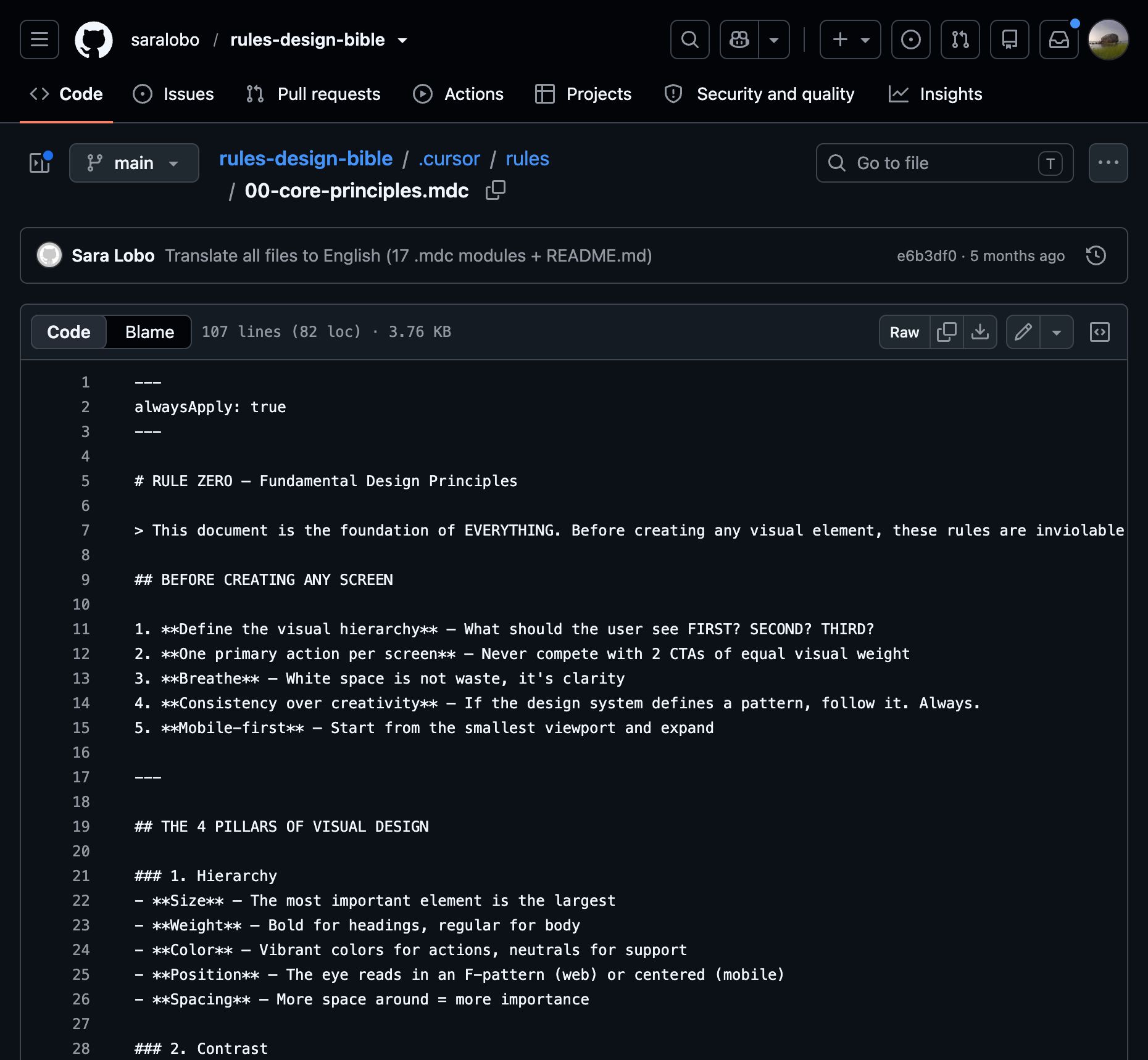
---
alwaysApply: true
---
# RULE ZERO — Fundamental Design Principles
> This document is the foundation of EVERYTHING. Before creating any visual element, these rules are inviolable.
## BEFORE CREATING ANY SCREEN
1. **Define the visual hierarchy** — What should the user see FIRST? SECOND? THIRD?
2. **One primary action per screen** — Never compete with 2 CTAs of equal visual weight
3. **Breathe** — White space is not waste, it's clarity
4. **Consistency over creativity** — If the design system defines a pattern, follow it. Always.
5. **Mobile-first** — Start from the smallest viewport and expand
---
## THE 4 PILLARS OF VISUAL DESIGN
### 1. Hierarchy
- **Size** — The most important element is the largest
- **Weight** — Bold for headings, regular for body
- **Color** — Vibrant colors for actions, neutrals for support
- **Position** — The eye reads in an F-pattern (web) or centered (mobile)
- **Spacing** — More space around = more importance
### 2. Contrast
- Don't use similar colors side by side
- Text over background needs a minimum ratio of 4.5:1 (WCAG AA)
- Large text (>18px bold or >24px regular): minimum ratio 3:1
- NEVER light gray on white — it's invisible
- Dark mode: Don't use pure white (#FFFFFF) on pure black (#000000) — causes visual vibration. Use #E0E0E0 on #121212
### 3. Alignment
- **Everything aligns to something** — If an element isn't aligned to any other, it's wrong
- Use an 8px grid for EVERYTHING (spacing, padding, margin, sizes)
- Left-align by default (LTR languages)
- Center only for screen titles, modals, and empty states
- NEVER mix different alignments in the same section
### 4. Proximity
- Related elements stay TOGETHER (8-12px)
- Unrelated elements stay APART (24-32px+)
- Space between groups must be AT LEAST 2x the space between items within the same group
- Label + Input = 4-8px gap
- Different sections = 32-48px gap
---
## GOLDEN RULES FOR MOBILE
### Touch Targets
- **Absolute minimum**: 44×44px (Apple HIG) / 48×48dp (Material Design)
- **Recommended**: 48×48px
- **Spacing between targets**: minimum 8px
- **Circular button MUST be circular**: width === height, cornerRadius = width/2
- NEVER create an oval button when the intent is circular
### Safe Areas
- **Top**: Respect the status bar (44px iOS, 24dp Android)
- **Bottom**: Respect the home indicator (34px iOS) and navigation bar
- **Thumb zone**: Primary actions in the bottom half of the screen (thumb reach)
- **Danger zone**: Top-left corner = hardest to reach
### Minimum Text Sizes
- **Body**: 16px minimum (NEVER smaller)
- **Caption/Helper**: 12px minimum (NEVER smaller)
- **Input label**: 14-16px
- **Screen title**: 20-28px
- **Display/Hero**: 32-48px
---
## PREDICTABILITY PRINCIPLE
The user must ALWAYS know:
1. **Where they are** — Screen title, breadcrumbs, active tab
2. **What they can do** — Visible buttons, clear affordances
3. **What will happen** — Descriptive labels ("Send Payment" not "Confirm")
4. **How to go back** — Back button, gesture, X to close
---
## PRE-CREATION CHECKLIST
Before creating any screen in Figma, answer:
- [ ] What is the SINGLE primary action of this screen?
- [ ] What is the visual hierarchy? (1st, 2nd, 3rd element)
- [ ] Does the spacing follow the 8px grid?
- [ ] Do touch targets have at least 44×44px?
- [ ] Is text contrast sufficient (4.5:1)?
- [ ] Does the user know how to go back?
- [ ] Is there enough breathing room between sections?
- [ ] Are all circular buttons ACTUALLY circular (width = height)?
---
## REFERENCE SOURCES
- "Don't Make Me Think" — Steve Krug
- "The Design of Everyday Things" — Don Norman
- "Refactoring UI" — Adam Wathan & Steve Schoger
- Apple Human Interface Guidelines (developer.apple.com/design)
- Material Design 3 (m3.material.io)
- Laws of UX (lawsofux.com)