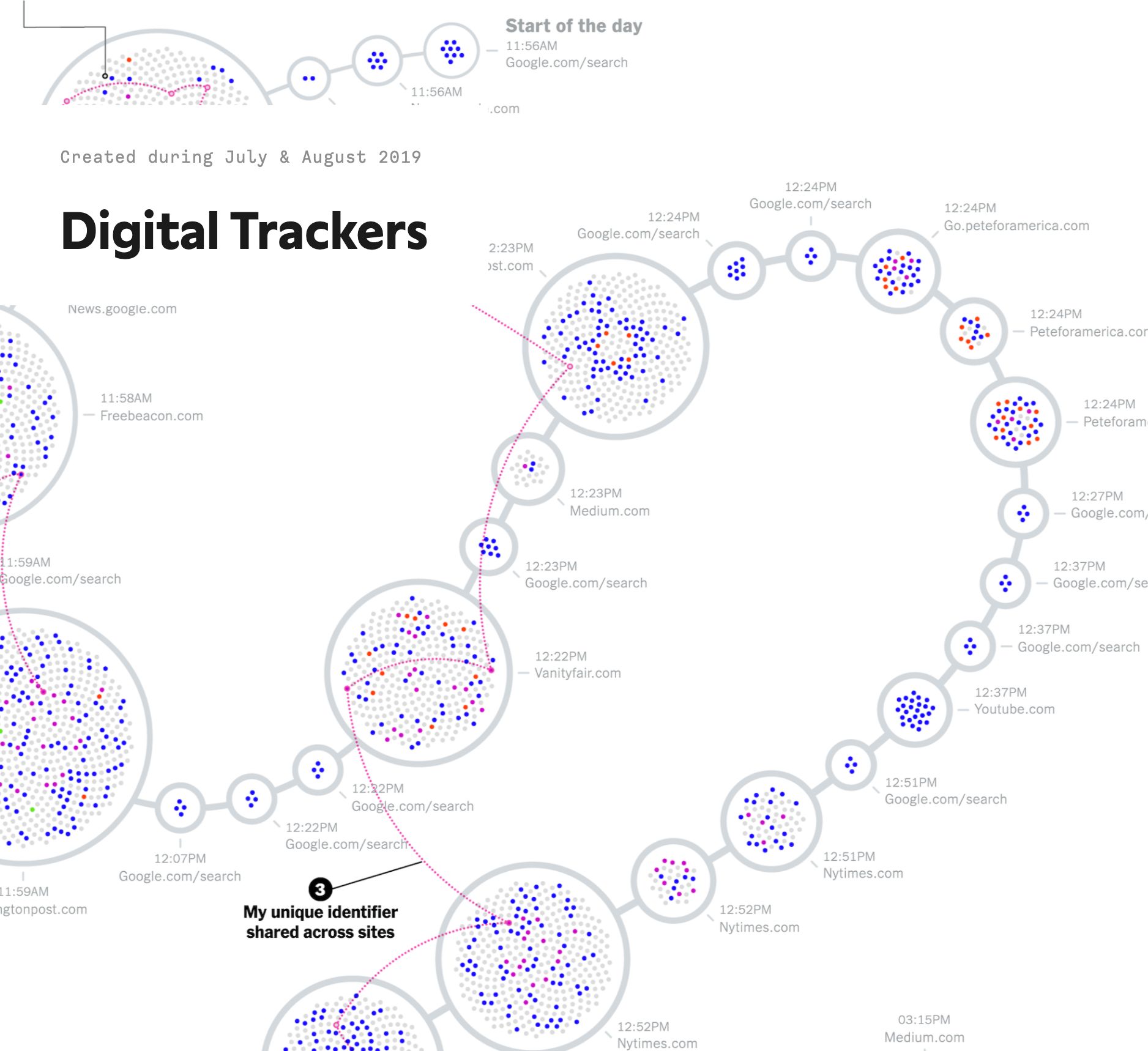
Revealing the insane amount of digital trackers that you gather while browsing the web for the New York Times
https://www.visualcinnamon.com/portfolio/new-york-times-digital-trackers/Reader - page text saved at the timeCLIENT
New York Times
LINK
Digital Trackers
AWARDS
Malofiej
CATEGORIES
Design
Static
Professional
TOOLS
Affinity Designer
d3.js
Illustrator
R
DATA
All trackers from a day of browsing by the writer
The New York Times had done a fascinating research on the insane number of digital trackers that you gather when you browse the web, well, anywhere. This resulted in a large dataset of trackers and metadata about what these trackers gathered and from which domain / company they originated. The New York Times reached out to me to help turn this large dataset into an eye-catching and illustrative visualization that would go in both the printed edition and online, revealing just how much information is being gathered on on the web that most of us never know or ever see.
award
Malofiej 2020
“Digital Trackers” won Silver for its print version and Bronze for the digital version at the 2020 Malofiej awards.
Malofiej is the yearly Infographic World Summit that hosts the awards for best data visualization / infographics published in print and on-line across the globe.
When the calls and emails with the New York Times got to the point where we discussed the specifics of the data, the idea of somehow visualizing the trackers along a natural-looking swirl came to mind quite quickly, especially as it would be a nice way to fill up a rectangular “space” on a newspaper page. And when they send a rough design idea of their own that was also abstractly a line with the trackers plotted along, I knew we were on the same page.
Creating these swirls wasn’t something that I could do with programming, that would never look truly natural. Instead I would draw out the swirl with my Apple Pen in Affinity Designer on my iPad, thus truly based on “hand drawn”, adjust it a little, and send it back to my computer. There I could read in the “swirl’s path” and use that in my program to calculate where exactly I would need to place each “website circle”.
I provided four different “swirls” (for desktop, tablet & mobile screen sizes, plus one for the printed edition) and the team at the NYT would add in the legend and annotations (and pick out the smaller “call-out” images in the second half of the article). Plus make sure that the right version of the image would be visible, depending on the width of the reader’s screen.
See also
portfolio
EU Data Stories
The creation of visuals for three of the EU's monthly Data Stories
portfolio
The Amsterdam Startup Landscape
A visualization about the decade of academic startups that have been helped by ACE/Cæmpus and the three Amsterdam Universities
portfolio
Adyen's Shareholder Report
Creating several bigger data visualizations to accompany Adyen's shareholder and yearly reports